How can I design for accessoryRectangular?
Asked on 2024-07-22
1 search

To design for accessoryRectangular in watchOS 11, you can use the new view template API called AccessoryWidgetGroup. This template allows you to create a view in an accessory rectangular widget that can contain up to three different pieces of content, enhancing glanceability.
Here are the key points to consider:
-
Components: The
AccessoryWidgetGroupconsists of two main components:labelandcontent.- Label: By default, it will display the name of the app's widget extension bundle, but you can provide a custom label or text view.
- Content: You can include up to three views. If more than three views are provided, only the first three will be shown. Each view can be interactive or can deep link to different parts of your app.
-
Preconfigured Settings: The font sizes, content view size, and content margins are preconfigured, allowing you to focus on the content of the widget.
-
Empty Views: If there are fewer than three views, the system will automatically insert empty views to ensure that three views appear in the widget. These empty views will launch the app when tapped.
-
Styling: You can use the
accessoryWidgetGroupStyleview modifier to specify the masking shape of the content views, either circular or rounded square. The default is circular if unspecified. Additionally, you can customize the colors:- Background: Tint using the
containerBackgroundview modifier. - Label: Tint using the
foregroundStyleview modifier.
- Background: Tint using the
For more detailed guidance, you can refer to the session What’s new in watchOS 11 (07:51).
Relevant Sessions
If you need more specific details or have other questions, feel free to ask!
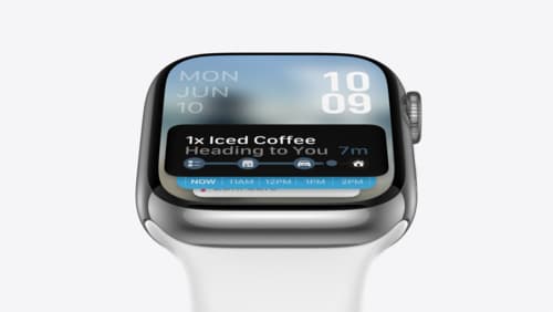
Design Live Activities for Apple Watch
Starting in watchOS 11, Live Activities from your iOS app will automatically appear in the Smart Stack on a connected Apple Watch. Learn how to optimize the layout of your Live Activity for the wrist, and provide the right level of information and interactivity at the right time.
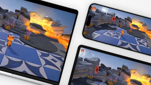
Design advanced games for Apple platforms
Learn how to adapt your high-end game so it feels at home on Mac, iPad, and iPhone. We’ll go over how to make your game look stunning on different displays, tailor your input and controls to be intuitive on each device, and take advantage of Apple technologies that deliver great player experiences.
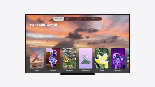
Migrate your TVML app to SwiftUI
SwiftUI helps you build great apps on all Apple platforms and is the preferred toolkit for bringing your content into the living room with tvOS 18. Learn how to use SwiftUI to create familiar layouts and controls from TVMLKit, and get tips and best practices.