Difference between SF UI Display and SF UI Text
Asked on 2024-07-31
1 search

SF UI Display and SF UI Text are two different typefaces designed by Apple for different purposes. Here are the key differences:
-
Purpose:
- SF UI Display: This typeface is optimized for larger text sizes, typically used for headings, titles, and other prominent text elements. It is designed to be legible and visually appealing at larger sizes.
- SF UI Text: This typeface is optimized for smaller text sizes, typically used for body text and other content that requires high readability at smaller sizes. It ensures clarity and legibility when text is small.
-
Design Characteristics:
- SF UI Display: The design of SF UI Display includes wider letter spacing and slightly different proportions to enhance readability and aesthetics at larger sizes.
- SF UI Text: The design of SF UI Text includes tighter letter spacing and adjustments to the letterforms to maintain legibility and readability at smaller sizes.
-
Usage in Apple Platforms:
- Both typefaces are part of the San Francisco family of fonts and are used across Apple's platforms, including iOS, macOS, watchOS, and tvOS. They are integrated into the system to provide a consistent and high-quality typographic experience.
For more detailed information on how to use these typefaces in your app, you can refer to the session Get started with Dynamic Type from WWDC 2024, which discusses how to scale text and use built-in text styles effectively.
Create custom visual effects with SwiftUI
Discover how to create stunning visual effects in SwiftUI. Learn to build unique scroll effects, rich color treatments, and custom transitions. We’ll also explore advanced graphic effects using Metal shaders and custom text rendering.
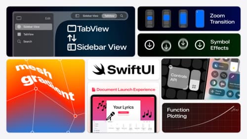
What’s new in SwiftUI
Learn how you can use SwiftUI to build great apps for any Apple platform. Explore a fresh new look and feel for tabs and documents on iPadOS. Improve your window management with new windowing APIs, and gain more control over immersive spaces and volumes in your visionOS apps. We’ll also take you through other exciting refinements that help you make expressive charts, customize and layout text, and so much more.
Get started with Dynamic Type
Dynamic Type lets people choose their preferred text size across the system and all of their apps. To help you get started supporting Dynamic Type, we’ll cover the fundamentals: How it works, how to find issues with scaling text in your app, and how to take practical steps using SwiftUI and UIKit to create a great Dynamic Type experience. We’ll also show how you can best use the Large Content Viewer to make navigation controls accessible to everyone.