How do I make a circle button with an SF Symbol
Asked on 2024-07-31
1 search

To create a circle button with an SF Symbol, you can use SwiftUI, which provides a straightforward way to achieve this. Here's a simple example:
import SwiftUI

struct CircleButton: View {
    var body: some View {
        Button(action: {
            // Action for the button
        }) {
            Image(systemName: "star.fill") // Replace with your desired SF Symbol
                .resizable()
                .aspectRatio(contentMode: .fit)
                .frame(width: 24, height: 24)
                .padding()
                .background(Circle().fill(Color.blue))
                .foregroundColor(.white)
        }
    }
}

struct ContentView: View {
    var body: some View {
        CircleButton()
    }
}

struct ContentView_Previews: PreviewProvider {
    static var previews: some View {
        ContentView()
    }
}
In this example:
Image(systemName: "star.fill")is used to display an SF Symbol. You can replace"star.fill"with any SF Symbol you prefer..resizable()and.aspectRatio(contentMode: .fit)ensure the symbol scales correctly..frame(width: 24, height: 24)sets the size of the symbol..padding()adds padding around the symbol..background(Circle().fill(Color.blue))creates a circular background with a blue color..foregroundColor(.white)sets the color of the symbol to white.
For more details on SF Symbols and their usage, you can refer to the session What’s new in SF Symbols 6.
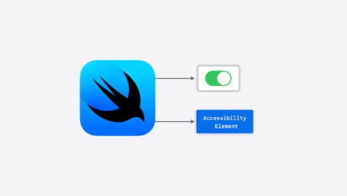
Catch up on accessibility in SwiftUI
SwiftUI makes it easy to build amazing experiences that are accessible to everyone. We’ll discover how assistive technologies understand and navigate your app through the rich accessibility elements provided by SwiftUI. We’ll also discuss how you can further customize these experiences by providing more information about your app’s content and interactions by using accessibility modifiers.
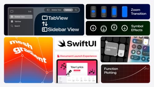
What’s new in SwiftUI
Learn how you can use SwiftUI to build great apps for any Apple platform. Explore a fresh new look and feel for tabs and documents on iPadOS. Improve your window management with new windowing APIs, and gain more control over immersive spaces and volumes in your visionOS apps. We’ll also take you through other exciting refinements that help you make expressive charts, customize and layout text, and so much more.
What’s new in AppKit
Discover the latest advances in Mac app development. Get an overview of the new features in macOS Sequoia, and how to adopt them in your app. Explore new ways to integrate your existing code with SwiftUI. Learn about the improvements made to numerous AppKit controls, like toolbars, menus, text input, and more.