what are ui guidelines
Asked on 2024-08-01
1 search

UI guidelines are principles and best practices that help developers design user interfaces that are intuitive, efficient, and consistent across different devices and platforms. Here are some key points from the WWDC sessions that touch on UI guidelines:
-
Safe Areas: When designing for different devices, it's important to keep safe areas in mind. Safe areas are regions of the display where you can safely place UI elements without them being obscured by hardware or software features. This is particularly important for devices with rounded corners, home indicators, or dynamic islands. (Design advanced games for Apple platforms)
-
Adaptive Layouts: Ensure your UI adapts to different aspect ratios and screen sizes. Instead of scaling the entire interface, break your layout into sections anchored to specific sides of the screen. This keeps controls at comfortable sizes and maintains a consistent look across devices. (Design advanced games for Apple platforms)
-
Full-Screen Design: For a full-screen experience, especially in games, make sure to design with safe areas in mind to avoid overlap with hardware features. (Design advanced games for Apple platforms)
-
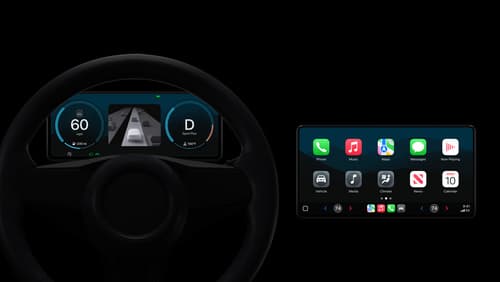
UI Elements in CarPlay: In CarPlay, the UI is divided into layers such as overlay UI and remote UI. Overlay UI includes essential indicators rendered by the system, while remote UI brings a familiar iPhone experience to the vehicle. (Meet the next generation of CarPlay architecture)
-
SwiftUI: SwiftUI is designed to help you build apps that work across all Apple devices. It handles details like dark mode, dynamic type, and tracking changes in your model, allowing you to focus on describing the UI you want. (Platforms State of the Union)
-
Document Launch Experience: For document-based apps, there's a redesigned launch experience that allows full control over launch views and design, helping to showcase the app's unique identity. (What’s new in UIKit)
-
UIUpdateLink: This feature in UIKit helps achieve better performance and battery efficiency by activating and deactivating based on the view's visibility. (What’s new in UIKit)
-
SF Symbols: SF Symbols ensure a consistent appearance for toolbar icons, navigation bars, and other UI elements. UIKit has expanded SF Symbols with new animation presets. (What’s new in UIKit)
For more detailed guidelines, you can refer to the specific sessions mentioned above.
Meet the next generation of CarPlay architecture
Dive into the architecture for the next generation of CarPlay. Learn how your vehicle system works with iPhone to create a single cohesive experience that showcases the best of your car and iPhone. Learn how UI is rendered and composited, and explore ways to configure and customize a special experience for each vehicle model. This session is intended for automakers and system developers interested in the next generation of CarPlay.

Platforms State of the Union
Discover the newest advancements on Apple platforms.
Design great visionOS apps
Find out how to create compelling spatial computing apps by embracing immersion, designing for eyes and hands, and taking advantage of depth, scale, and space. We’ll share several examples of great visionOS apps and explore how their designers approached creating new experiences for the platform.