button shapes?
Asked on 2024-08-01
1 search

Button shapes and styles were discussed in several sessions at WWDC 2024. Here are some key points:
-
SwiftUI Essentials:
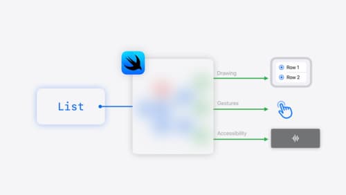
- Buttons in SwiftUI are adaptive views that can change their style based on context. They can be borderless, bordered, or prominent, and adapt to different contexts like swipe actions, menus, and forms. This adaptivity allows buttons to maintain their purpose of a labeled action while fitting into various UI designs (SwiftUI essentials).
-
Migrate your TVML app to SwiftUI:
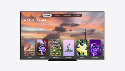
- On tvOS, buttons use the bordered button style by default, which includes a background platter that lifts and changes color when focused. For a different appearance, the borderless button style can be used, which provides a more subtle interaction with rounded corners and a slight drop shadow. The card button style offers another option with a rounded platter that lifts and moves subtly (Migrate your TVML app to SwiftUI).
-
Create custom hover effects in visionOS:
- Custom button styles can be created to control how buttons look and behave. For example, buttons can scale up when focused, and clip effects can be used to hide and reveal additional content. These effects can be customized to provide detailed visual feedback and ensure accessibility (Create custom hover effects in visionOS).
-
Extend your app’s controls across the system:
- Controls, including buttons, can be used to provide quick access to actions from your app. Buttons perform discrete actions and can be customized with symbols, titles, tint colors, and additional content to fit the system space they are in (Extend your app’s controls across the system).
-
Design advanced games for Apple platforms:
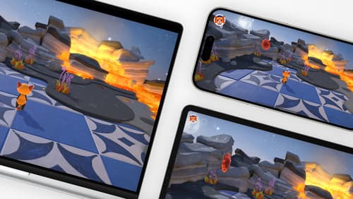
- In game design, buttons should provide visual feedback when pressed, such as darkening or highlighting. This feedback can be enhanced with visual effects like glows, sound, and haptics to ensure controls feel responsive and integrate well into the game's visual style (Design advanced games for Apple platforms).
Relevant Sessions
SwiftUI essentials
Join us on a tour of SwiftUI, Apple’s declarative user interface framework. Learn essential concepts for building apps in SwiftUI, like views, state variables, and layout. Discover the breadth of APIs for building fully featured experiences and crafting unique custom components. Whether you’re brand new to SwiftUI or an experienced developer, you’ll learn how to take advantage of what SwiftUI has to offer when building great apps.
Design advanced games for Apple platforms
Learn how to adapt your high-end game so it feels at home on Mac, iPad, and iPhone. We’ll go over how to make your game look stunning on different displays, tailor your input and controls to be intuitive on each device, and take advantage of Apple technologies that deliver great player experiences.
Migrate your TVML app to SwiftUI
SwiftUI helps you build great apps on all Apple platforms and is the preferred toolkit for bringing your content into the living room with tvOS 18. Learn how to use SwiftUI to create familiar layouts and controls from TVMLKit, and get tips and best practices.