responsive app design
Asked on 2024-08-02
1 search

Responsive app design is a key focus in several sessions at WWDC 2024. Here are some insights and recommendations from different sessions:
-
SwiftUI Essentials:
- SwiftUI provides built-in adaptivity, making it easier to create responsive designs. It supports features like dark mode, dynamic type, and localization, which help in making your app adaptable to different user preferences and contexts. You can preview these changes in Xcode without running the app repeatedly (SwiftUI essentials).
-
Design Advanced Games for Apple Platforms:
- For games, it's important to ensure your layout adapts to different aspect ratios and screen sizes. Breaking your UI layout into separate sections anchored to specific sides of the screen can help maintain consistency and usability across devices. This method keeps controls at comfortable sizes and makes the best use of screen space (Design advanced games for Apple platforms).
-
Design Great visionOS Apps:
- When designing for visionOS, ensure that interactive elements have sufficient tap targets (at least 60 points of space) to avoid frustration. The UI should be contained within a window, with controls like tab bars and toolbars anchored to the view, making it easier to navigate and reposition in physical space (Design great visionOS apps).
-
Get Started with HealthKit in visionOS:
- Utilize the infinite spatial canvas of visionOS to enhance user experience. For example, making charts dynamically resizable allows users to see more data at a glance when they expand the app window. This can be achieved using new SwiftUI APIs like
onGeometryChange(Get started with HealthKit in visionOS).
- Utilize the infinite spatial canvas of visionOS to enhance user experience. For example, making charts dynamically resizable allows users to see more data at a glance when they expand the app window. This can be achieved using new SwiftUI APIs like
These sessions provide a comprehensive guide to making your app responsive and adaptable across different Apple platforms. For more detailed information, you can refer to the specific sessions mentioned above.
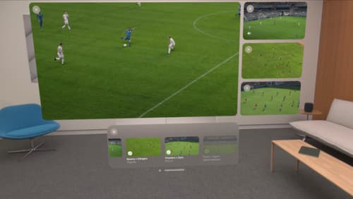
Explore multiview video playback in visionOS
Learn how AVExperienceController can enable playback of multiple videos on Apple Vision Pro. Review best practices for adoption and explore great use cases, like viewing a sports broadcast from different angles or watching multiple games simultaneously. And discover how to design a compelling and intuitive multiview experience in your app.
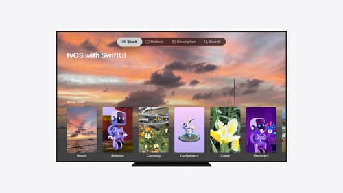
Migrate your TVML app to SwiftUI
SwiftUI helps you build great apps on all Apple platforms and is the preferred toolkit for bringing your content into the living room with tvOS 18. Learn how to use SwiftUI to create familiar layouts and controls from TVMLKit, and get tips and best practices.
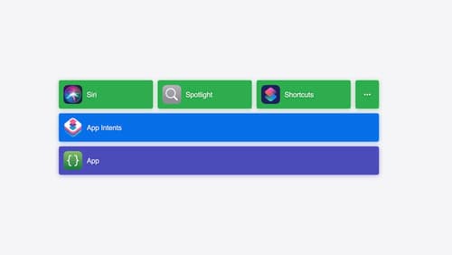
Bring your app’s core features to users with App Intents
Learn the principles of the App Intents framework, like intents, entities, and queries, and how you can harness them to expose your app’s most important functionality right where people need it most. Find out how to build deep integration between your app and the many system features built on top of App Intents, including Siri, controls and widgets, Apple Pencil, Shortcuts, the Action button, and more. Get tips on how to build your App Intents integrations efficiently to create the best experiences in every surface while still sharing code and core functionality.