How do I handle ipad layout
Asked on 2024-08-02
1 search

To handle iPad layout effectively, you can follow several best practices discussed in various WWDC sessions:
-
Design for Different Aspect Ratios:
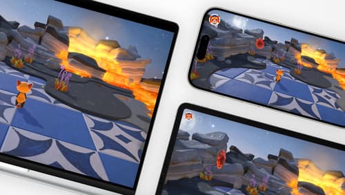
- Ensure your layout reacts to different aspect ratios. This is crucial as different device models can have varying aspect ratios. Instead of scaling your interface up or down, break your UI layout into separate sections, each anchored to a specific side of the screen. This approach keeps controls at physically comfortable sizes and makes the best use of screen space across devices. (Design advanced games for Apple platforms)
-
Utilize Safe Areas:
- Design for the full screen by keeping safe areas in mind. Safe areas help you avoid placing UI elements where they could be obscured by the device's rounded corners, the system home indicator, or other hardware and software features. (Design advanced games for Apple platforms)
-
Flexible Layouts:
- Plan early to design an adaptive game interface that scales. This not only saves time but also future-proofs your game for new devices. (Design advanced games for Apple platforms)
-
Dynamic Type and Layouts:
- Use
UIStackViewin UIKit to lay out subviews vertically or horizontally. Adjust the layout dynamically based on text size changes to ensure readability and avoid truncations. (Get started with Dynamic Type)
- Use
-
Tab Bar and Sidebar Enhancements:
- In iPadOS, tabs should be consistent between iPhone and iPad to allow easy navigation. Avoid adding too many tabs to prevent overwhelming users. Sidebars can provide quick access to top-level destinations and can now be displayed as a sidebar with several enhancements in iPadOS 18. (Elevate your tab and sidebar experience in iPadOS)
-
Testing on Real Devices:
- Test your layout on as many devices as possible to ensure it looks and behaves correctly. This helps in making sure that players feel comfortable no matter what hardware they're using. (Design advanced games for Apple platforms)
Relevant Sessions:
- Design advanced games for Apple platforms
- Get started with Dynamic Type
- Elevate your tab and sidebar experience in iPadOS
By following these guidelines, you can create a flexible and user-friendly layout for iPad that adapts to different screen sizes and user preferences.
Design advanced games for Apple platforms
Learn how to adapt your high-end game so it feels at home on Mac, iPad, and iPhone. We’ll go over how to make your game look stunning on different displays, tailor your input and controls to be intuitive on each device, and take advantage of Apple technologies that deliver great player experiences.
Get started with Dynamic Type
Dynamic Type lets people choose their preferred text size across the system and all of their apps. To help you get started supporting Dynamic Type, we’ll cover the fundamentals: How it works, how to find issues with scaling text in your app, and how to take practical steps using SwiftUI and UIKit to create a great Dynamic Type experience. We’ll also show how you can best use the Large Content Viewer to make navigation controls accessible to everyone.
Design great visionOS apps
Find out how to create compelling spatial computing apps by embracing immersion, designing for eyes and hands, and taking advantage of depth, scale, and space. We’ll share several examples of great visionOS apps and explore how their designers approached creating new experiences for the platform.