How to make non gray disabled button in swiftui
Asked on 2024-08-04
1 search

To create a non-gray disabled button in SwiftUI, you can use the ButtonStyle protocol to customize the appearance of your button, including its disabled state. Here's an example of how you can achieve this:
import SwiftUI

struct CustomButtonStyle: ButtonStyle {
    func makeBody(configuration: Configuration) -> some View {
        configuration.label
            .padding()
            .background(configuration.isPressed ? Color.blue : Color.green)
            .foregroundColor(.white)
            .cornerRadius(8)
            .opacity(configuration.isPressed ? 0.5 : 1.0)
            .overlay(
                RoundedRectangle(cornerRadius: 8)
                    .stroke(Color.blue, lineWidth: 2)
            )
            .opacity(configuration.isEnabled ? 1.0 : 0.5) // Adjust opacity for disabled state
    }
}

struct ContentView: View {
    @State private var isDisabled = true

    var body: some View {
        VStack {
            Button("Tap me") {
                print("Button tapped")
            }
            .buttonStyle(CustomButtonStyle())
            .disabled(isDisabled)

            Toggle("Disable Button", isOn: $isDisabled)
                .padding()
        }
    }
}

struct ContentView_Previews: PreviewProvider {
    static var previews: some View {
        ContentView()
    }
}
In this example, the CustomButtonStyle struct conforms to the ButtonStyle protocol and customizes the button's appearance. The opacity modifier is used to change the button's opacity when it is disabled, but you can customize other properties as well to achieve the desired look.
For more information on customizing button styles and ensuring accessibility, you can refer to the session Catch up on accessibility in SwiftUI from WWDC 2024.
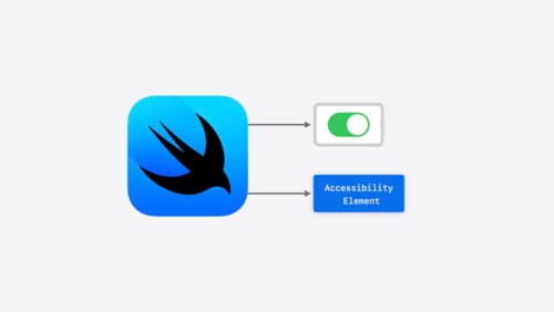
Catch up on accessibility in SwiftUI
SwiftUI makes it easy to build amazing experiences that are accessible to everyone. We’ll discover how assistive technologies understand and navigate your app through the rich accessibility elements provided by SwiftUI. We’ll also discuss how you can further customize these experiences by providing more information about your app’s content and interactions by using accessibility modifiers.
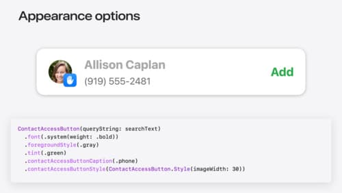
Meet the Contact Access Button
Learn about the new Contacts authorization modes and how to improve Contacts access in your app. Discover how to integrate the Contact Access Button into your app to share additional contacts on demand and provide an easier path to Contacts authorization. We’ll also cover Contacts security features and an alternative API to be used if the button isn’t appropriate for your app.
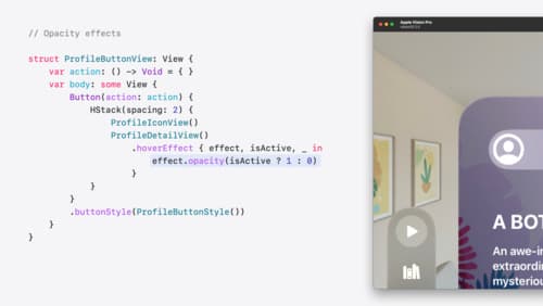
Create custom hover effects in visionOS
Learn how to develop custom hover effects that update views when people look at them. Find out how to build an expanding button effect that combines opacity, scale, and clip effects. Discover best practices for creating effects that are comfortable and respect people’s accessibility needs.