How to make custom buttons with swiftui?
Asked on 2024-08-04
1 search
To create custom buttons with SwiftUI, you can leverage the built-in capabilities and styles provided by SwiftUI. Here are some key points and examples from the sessions:
-
Adaptive Views: SwiftUI buttons are adaptive and can be customized in various styles such as borderless, bordered, or prominent. They adapt to different contexts like swipe actions, menus, and forms. This adaptability allows you to create buttons that fit seamlessly into different parts of your app.
- Example: You can create a button with a custom label and action:
Button(action: {
    // Your action here
}) {
    Text("Custom Button")
        .padding()
        .background(Color.blue)
        .foregroundColor(.white)
        .cornerRadius(8)
}
- Example: You can create a button with a custom label and action:
-
Button Styles: SwiftUI provides different button styles that you can use to achieve various looks and behaviors. For instance, the
borderlessButtonStyleandcardButtonStylecan be used to create different visual effects.- Example: Using
cardButtonStylefor a more subtle interaction:Button(action: { // Your action here }) { Text("Card Button") } .buttonStyle(CardButtonStyle())
- Example: Using
-
Custom Control Styles: If you need more control over the appearance and behavior of your buttons, you can create custom control styles.
- Example: Creating a custom button style:
struct CustomButtonStyle: ButtonStyle {
    func makeBody(configuration: Configuration) -> some View {
        configuration.label
            .padding()
            .background(configuration.isPressed ? Color.gray : Color.blue)
            .foregroundColor(.white)
            .cornerRadius(8)
    }
}

Button(action: {
    // Your action here
}) {
    Text("Custom Styled Button")
}
.buttonStyle(CustomButtonStyle())
- Example: Creating a custom button style:
For more detailed information and examples, you can refer to the SwiftUI essentials session, which covers the fundamentals and built-in capabilities of SwiftUI, including buttons and other controls.
Relevant Sessions
These sessions provide a comprehensive overview of how to create and customize buttons in SwiftUI, along with other controls and accessibility features.

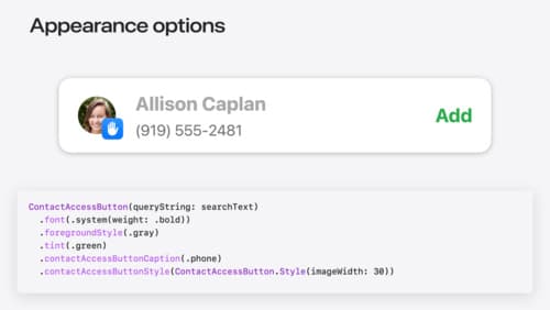
Meet the Contact Access Button
Learn about the new Contacts authorization modes and how to improve Contacts access in your app. Discover how to integrate the Contact Access Button into your app to share additional contacts on demand and provide an easier path to Contacts authorization. We’ll also cover Contacts security features and an alternative API to be used if the button isn’t appropriate for your app.

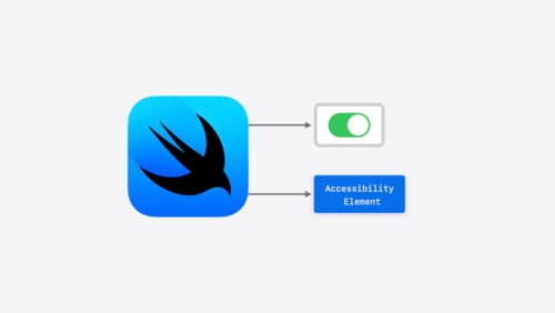
Catch up on accessibility in SwiftUI
SwiftUI makes it easy to build amazing experiences that are accessible to everyone. We’ll discover how assistive technologies understand and navigate your app through the rich accessibility elements provided by SwiftUI. We’ll also discuss how you can further customize these experiences by providing more information about your app’s content and interactions by using accessibility modifiers.

What’s new in AppKit
Discover the latest advances in Mac app development. Get an overview of the new features in macOS Sequoia, and how to adopt them in your app. Explore new ways to integrate your existing code with SwiftUI. Learn about the improvements made to numerous AppKit controls, like toolbars, menus, text input, and more.
