How do I customize the style of navigation link view
Asked on 2024-08-05
1 search

To customize the style of a navigation link view, you can refer to the session "Customize feature discovery with TipKit" from WWDC 2024. This session provides insights into creating custom styles for views, including tips on making the entire view tappable and using properties from the configuration argument to ensure closures and modifiers are evaluated correctly.
Here are some key points from the session:
-
Custom Tip View Style:
- Use the properties from the
makeBodyfunction's configuration argument instead of the instance values to allow any modifiers applied to your tip view to work with the message and title in your custom style. - Apply the custom style by calling the
tipViewStylemodifier.
- Use the properties from the
-
Making the Entire View Tappable:
- Get the action from the configuration argument and call the action handler when the tip view is tapped.
- Use the
actionsproperty from the configuration argument to ensure the handler is part of your tip view and is called when the action is performed.
For more detailed information, you can watch the session Customize feature discovery with TipKit (08:26).
Relevant Sessions
These sessions provide a comprehensive overview of customizing views and ensuring accessibility and proper styling in SwiftUI.
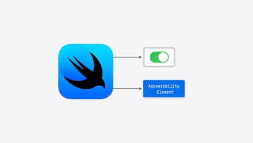
Catch up on accessibility in SwiftUI
SwiftUI makes it easy to build amazing experiences that are accessible to everyone. We’ll discover how assistive technologies understand and navigate your app through the rich accessibility elements provided by SwiftUI. We’ll also discuss how you can further customize these experiences by providing more information about your app’s content and interactions by using accessibility modifiers.
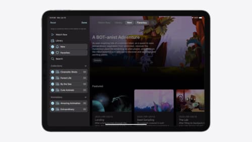
Elevate your tab and sidebar experience in iPadOS
iPadOS 18 introduces a new navigation system that gives people the flexibility to choose between using a tab bar or sidebar. The newly redesigned tab bar provides more space for content and other functionality. Learn how to use SwiftUI and UIKit to enable customization features – like adding, removing and reordering tabs – to enable a more personal touch in your app.
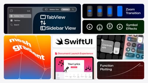
What’s new in SwiftUI
Learn how you can use SwiftUI to build great apps for any Apple platform. Explore a fresh new look and feel for tabs and documents on iPadOS. Improve your window management with new windowing APIs, and gain more control over immersive spaces and volumes in your visionOS apps. We’ll also take you through other exciting refinements that help you make expressive charts, customize and layout text, and so much more.