how do i style a button
Asked on 2024-07-30
1 search

To style a button in SwiftUI, you can use various built-in styles or create custom styles depending on your needs. Here are some examples from different sessions at WWDC:
-
Borderless Button Style:
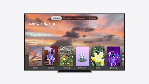
- In the session Migrate your TVML app to SwiftUI, it is mentioned that you can use the
borderless button styleto achieve a specific appearance. This style is useful when you want the button to have a more subtle look without a background platter.
- In the session Migrate your TVML app to SwiftUI, it is mentioned that you can use the
-
Card Button Style:
- The same session also discusses the
card button style, which provides a rounded platter to back your content. This style is more subtle than the borderless button style and is useful for creating lockups similar to those in the TV app's search results. You can see this at Migrate your TVML app to SwiftUI.
- The same session also discusses the
-
Custom Button Style:
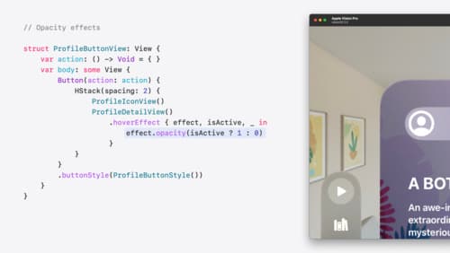
- In the session Create custom hover effects in visionOS, a custom button style is used to control the button's appearance. This involves using the
hover effectmodifier to add effects like scaling and clipping. For example, you can make the button scale up when it is focused or hovered over.
- In the session Create custom hover effects in visionOS, a custom button style is used to control the button's appearance. This involves using the
-
Contact Access Button Style:
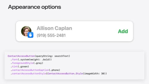
- The session Meet the Contact Access Button introduces the
contact access button style, which allows customization of the contact photo size and caption. This button is designed to display sensitive information with strong privacy protections.
- The session Meet the Contact Access Button introduces the
-
Accessibility Considerations:
- The session Catch up on accessibility in SwiftUI emphasizes using the styling system over creating custom views to maintain accessibility properties. This ensures that attributes and actions are preserved even when the visual style of the button is changed.
By leveraging these styles and modifiers, you can create buttons that not only look great but also provide a good user experience across different platforms and accessibility settings.
Migrate your TVML app to SwiftUI
SwiftUI helps you build great apps on all Apple platforms and is the preferred toolkit for bringing your content into the living room with tvOS 18. Learn how to use SwiftUI to create familiar layouts and controls from TVMLKit, and get tips and best practices.
Create custom hover effects in visionOS
Learn how to develop custom hover effects that update views when people look at them. Find out how to build an expanding button effect that combines opacity, scale, and clip effects. Discover best practices for creating effects that are comfortable and respect people’s accessibility needs.
Meet the Contact Access Button
Learn about the new Contacts authorization modes and how to improve Contacts access in your app. Discover how to integrate the Contact Access Button into your app to share additional contacts on demand and provide an easier path to Contacts authorization. We’ll also cover Contacts security features and an alternative API to be used if the button isn’t appropriate for your app.