buttonstyle
Asked on 2024-08-08
1 search

Button Styles in WWDC 2024
Sessions Mentioned:
- Migrate your TVML app to SwiftUI
- What’s new in StoreKit and In-App Purchase
- Extend your app’s controls across the system
- Create custom hover effects in visionOS
- Catch up on accessibility in SwiftUI
- Customize feature discovery with TipKit
Relevant Information:
-
Migrate your TVML app to SwiftUI:
- Borderless Button Style: Used to achieve a specific appearance where the image and title are in the right orientation, and the image has rounded corners and a slight drop shadow. When focused, the image lifts, the text moves down, and a specular highlight appears. (Migrate your TVML app to SwiftUI)
- Card Button Style: Provides a rounded platter to back your content, which lifts and moves in a more subtle manner than the borderless button style. (Migrate your TVML app to SwiftUI)
-
What’s new in StoreKit and In-App Purchase:
- Subscribe Button API: Allows you to either build your own subscribe button or use the new subscribe button API to trigger a purchase for the selected option. (What’s new in StoreKit and In-App Purchase)
-
Extend your app’s controls across the system:
- Customizing Control's Value Text: You can customize the control's value text by changing the image to a label that includes both the value text and system image. (Extend your app’s controls across the system)
-
Create custom hover effects in visionOS:
- Custom Button Style: Used to control how the button looks, including adding a scale effect when the button is highlighted. (Create custom hover effects in visionOS)
-
Catch up on accessibility in SwiftUI:
- Styles for Accessibility: Supported across many different controls like button and toggle groupings, and indicators like Progress View and gauge. (Catch up on accessibility in SwiftUI)
-
Customize feature discovery with TipKit:
- Custom Tip View Style: Allows making the entire tip view tappable and ensures the handler created is part of the tip view. (Customize feature discovery with TipKit)
Summary
WWDC 2024 introduced various button styles and customization options across different sessions. From the borderless and card button styles in SwiftUI for TVML apps to the subscribe button API in StoreKit, and custom button styles in visionOS, developers have a wide range of tools to create interactive and accessible user interfaces.
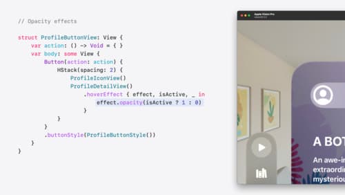
Create custom hover effects in visionOS
Learn how to develop custom hover effects that update views when people look at them. Find out how to build an expanding button effect that combines opacity, scale, and clip effects. Discover best practices for creating effects that are comfortable and respect people’s accessibility needs.
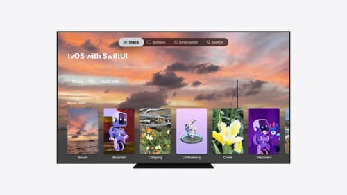
Migrate your TVML app to SwiftUI
SwiftUI helps you build great apps on all Apple platforms and is the preferred toolkit for bringing your content into the living room with tvOS 18. Learn how to use SwiftUI to create familiar layouts and controls from TVMLKit, and get tips and best practices.
What’s new in AppKit
Discover the latest advances in Mac app development. Get an overview of the new features in macOS Sequoia, and how to adopt them in your app. Explore new ways to integrate your existing code with SwiftUI. Learn about the improvements made to numerous AppKit controls, like toolbars, menus, text input, and more.