Swiftui button style
Asked on 2024-08-12
1 search

In SwiftUI, button styles can be customized to fit the design and functionality of your app. Here are some insights from the WWDC sessions:
-
Adaptive Button Styles: SwiftUI buttons are adaptive and can be styled in various ways such as borderless, bordered, or prominent. They automatically adapt to different contexts like swipe actions, menus, and forms. This adaptability allows for a consistent user experience across different platforms and use cases. SwiftUI essentials.
-
Card Button Style: In the context of migrating TVML apps to SwiftUI, the card button style is used to create lockups similar to those in the TV app's search results. This style provides a rounded platter for content, offering a subtle lift and movement compared to the borderless button style. Migrate your TVML app to SwiftUI.
-
Borderless Button Style: This style is used to achieve a specific appearance where the button's image and title are oriented correctly, with rounded corners and a slight drop shadow. It is particularly useful for creating interactive elements that respond to user focus, such as in tvOS applications. Migrate your TVML app to SwiftUI.
-
Custom Hover Effects: In visionOS, custom hover effects can be applied to buttons to create interactive experiences. For example, a button can scale up when looked at, and clip effects can be used to reveal additional content. Create custom hover effects in visionOS.
These styles and techniques allow developers to create buttons that are not only visually appealing but also provide a great user experience across different Apple platforms.
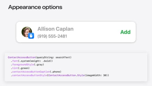
Meet the Contact Access Button
Learn about the new Contacts authorization modes and how to improve Contacts access in your app. Discover how to integrate the Contact Access Button into your app to share additional contacts on demand and provide an easier path to Contacts authorization. We’ll also cover Contacts security features and an alternative API to be used if the button isn’t appropriate for your app.
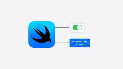
Catch up on accessibility in SwiftUI
SwiftUI makes it easy to build amazing experiences that are accessible to everyone. We’ll discover how assistive technologies understand and navigate your app through the rich accessibility elements provided by SwiftUI. We’ll also discuss how you can further customize these experiences by providing more information about your app’s content and interactions by using accessibility modifiers.
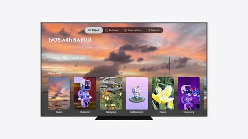
Migrate your TVML app to SwiftUI
SwiftUI helps you build great apps on all Apple platforms and is the preferred toolkit for bringing your content into the living room with tvOS 18. Learn how to use SwiftUI to create familiar layouts and controls from TVMLKit, and get tips and best practices.