swift charts
Asked on 2024-09-06
1 search

Swift Charts: Vectorized and Function Plots
Swift Charts has introduced several new features to enhance data visualization capabilities. Here are some key highlights:
-
Function Plots: Swift Charts now supports plotting mathematical functions, allowing you to visualize beyond just data. You can create line plots for single functions and area plots to fill the area between two functions. This is particularly useful for data analysis, such as visualizing solar energy projects or plotting normal distribution curves.
-
Parametric and Piecewise Functions: You can plot parametric functions where x and y are defined in terms of a third variable, t. Swift Charts also handles piecewise functions by allowing you to return
NaNfor undefined values, ensuring smooth plotting. -
Vectorized Plots: The new vectorized plotting APIs, like rectangle plots, enable efficient visualization of larger datasets. This is achieved by processing entire collections of data points with consistent styling, which is particularly useful for datasets with raw GPS coordinates or solar panel installations.
-
Accessibility: Swift Charts ensures that visualizations are accessible by default, with features like VoiceOver to describe charts.
For more detailed insights, you can explore the session Swift Charts: Vectorized and function plots (00:01:01) which covers function plots, and Vectorized plots (00:06:48) for vectorized plotting techniques.
Related Sessions
- What’s new in SwiftUI: This session also touches on improvements in Swift Charts, particularly in the context of creating dynamic and colorful visualizations. You can check out the section on Vectorized and function plots (00:03:38) for more information.
These sessions provide a comprehensive overview of the new capabilities in Swift Charts, making it easier to create informative and accessible visualizations.
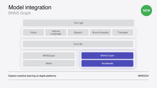
Support real-time ML inference on the CPU
Discover how you can use BNNSGraph to accelerate the execution of your machine learning model on the CPU. We will show you how to use BNNSGraph to compile and execute a machine learning model on the CPU and share how it provides real-time guarantees such as no runtime memory allocation and single-threaded running for audio or signal processing models.

Swift Charts: Vectorized and function plots
The plot thickens! Learn how to render beautiful charts representing math functions and extensive datasets using function and vectorized plots in your app. Whether you’re looking to display functions common in aerodynamics, magnetism, and higher order field theory, or create large interactive heat maps, Swift Charts has you covered.
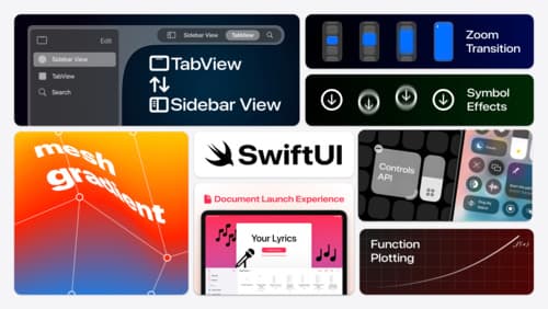
What’s new in SwiftUI
Learn how you can use SwiftUI to build great apps for any Apple platform. Explore a fresh new look and feel for tabs and documents on iPadOS. Improve your window management with new windowing APIs, and gain more control over immersive spaces and volumes in your visionOS apps. We’ll also take you through other exciting refinements that help you make expressive charts, customize and layout text, and so much more.