swiftui charts
Asked on 2024-09-08
1 search

SwiftUI Charts have introduced several new features and improvements, particularly focusing on vectorized and function plots. These enhancements make it easier to create accessible and visually appealing data visualizations. Here are some key points from the sessions:
-
Function Plots: Swift Charts now support plotting mathematical functions, allowing for the visualization of weather trends, mood tracking, and more. You can create line plots for single functions and area plots to fill the area between two functions. This is particularly useful for data analysis and visualizing mathematical functions in apps.
-
Vectorized Plots: The new vectorized plotting APIs enable more efficient visualization of larger datasets. This includes the ability to handle parametric functions and piecewise functions, where you can return
NaNfor undefined values. -
Customization: Swift Charts allows for extensive customization, such as changing the color and opacity of plots to enhance legibility and contrast. You can also customize the x and y scales to focus on specific parts of a function.
-
Performance: By using stored properties and key paths, Swift Charts can access data points more efficiently, improving performance when dealing with large datasets.
For more detailed information, you can refer to the session Swift Charts: Vectorized and function plots (00:01:01) which covers these topics extensively.
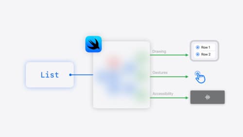
SwiftUI essentials
Join us on a tour of SwiftUI, Apple’s declarative user interface framework. Learn essential concepts for building apps in SwiftUI, like views, state variables, and layout. Discover the breadth of APIs for building fully featured experiences and crafting unique custom components. Whether you’re brand new to SwiftUI or an experienced developer, you’ll learn how to take advantage of what SwiftUI has to offer when building great apps.
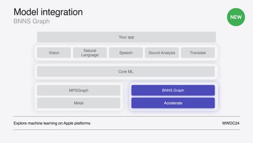
Support real-time ML inference on the CPU
Discover how you can use BNNSGraph to accelerate the execution of your machine learning model on the CPU. We will show you how to use BNNSGraph to compile and execute a machine learning model on the CPU and share how it provides real-time guarantees such as no runtime memory allocation and single-threaded running for audio or signal processing models.

Swift Charts: Vectorized and function plots
The plot thickens! Learn how to render beautiful charts representing math functions and extensive datasets using function and vectorized plots in your app. Whether you’re looking to display functions common in aerodynamics, magnetism, and higher order field theory, or create large interactive heat maps, Swift Charts has you covered.