tinted app icon
Asked on 2024-09-13
1 search

At WWDC 2024, Apple introduced new customization options for app icons in iOS 18, allowing them to appear light, dark, or with a tint. A tinted version of your app icon will automatically be available to users after they upgrade to iOS 18. This feature is designed to preserve the design intent and maintain legibility, ensuring a consistent visual experience across the home screen. Developers can customize each version of their app icon to ensure it looks great in all appearances. Xcode now supports dark and tinted app icon variants that can be added directly into the asset catalog.
For more details, you can refer to the Platforms State of the Union (45:04) session.
What’s new in AppKit
Discover the latest advances in Mac app development. Get an overview of the new features in macOS Sequoia, and how to adopt them in your app. Explore new ways to integrate your existing code with SwiftUI. Learn about the improvements made to numerous AppKit controls, like toolbars, menus, text input, and more.
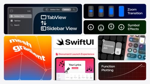
What’s new in SwiftUI
Learn how you can use SwiftUI to build great apps for any Apple platform. Explore a fresh new look and feel for tabs and documents on iPadOS. Improve your window management with new windowing APIs, and gain more control over immersive spaces and volumes in your visionOS apps. We’ll also take you through other exciting refinements that help you make expressive charts, customize and layout text, and so much more.
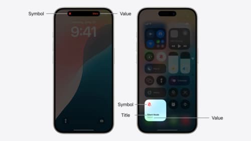
Extend your app’s controls across the system
Bring your app’s controls to Control Center, the Lock Screen, and beyond. Learn how you can use WidgetKit to extend your app’s controls to the system experience. We’ll cover how you can to build a control, tailor its appearance, and make it configurable.