How to use ButtonStyle
Asked on 2024-11-10
1 search

To use ButtonStyle in SwiftUI, you can customize the appearance and behavior of buttons by creating a custom style. Here's a brief overview based on the content from WWDC:
-
Custom Button Styles: You can define a custom button style by conforming to the
ButtonStyleprotocol. This allows you to control how the button looks and behaves. For example, you can use thehover effectmodifier to add effects like scaling or highlighting when the button is interacted with. -
Using Built-in Styles: SwiftUI provides several built-in button styles, such as
borderlessButtonStyleandcardButtonStyle. These styles can be applied to buttons to achieve different visual effects. For instance, thecardButtonStyleprovides a rounded platter that subtly lifts and moves, which is useful for creating lockups similar to those in the TV app's search results. -
Accessibility Considerations: When creating custom button styles, it's important to consider accessibility. Use the styling system over creating a custom view whenever possible to automatically get accessibility properties. You can also use accessibility modifiers to customize how a view is represented by an accessibility element.
For more detailed information on creating custom hover effects in visionOS, you can refer to the session Create custom hover effects in visionOS (03:57).
Relevant Sessions
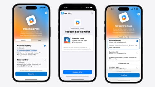
What’s new in StoreKit and In-App Purchase
Learn how to build and deliver even better purchase experiences using the App Store In-App Purchase system. We’ll demo new StoreKit views control styles and new APIs to improve your subscription customization, discuss new fields for transaction-level information, and explore new testability in Xcode. We’ll also review an important StoreKit deprecation.
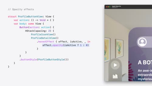
Create custom hover effects in visionOS
Learn how to develop custom hover effects that update views when people look at them. Find out how to build an expanding button effect that combines opacity, scale, and clip effects. Discover best practices for creating effects that are comfortable and respect people’s accessibility needs.
Customize feature discovery with TipKit
Focused on feature discovery, the TipKit framework makes it easy to display tips in your app. Now you can group tips so features are discovered in the ideal order, make tips reusable with custom tip identifiers, match the look and feel to your app, and sync tips using CloudKit. Learn how you can use the latest advances in TipKit to help people discover everything your app has to offer.