In Swift for iOS, By default the icon of a button is verically centered next to the buttons title. How can I align the icon top-left of the UIButton title when the button also has a subtitle. The button is configured with a UIButton configuration.
Asked on 2025-02-14
1 search

To align the icon of a UIButton to the top-left of the button's title when using a UIButton configuration, you can customize the button's layout by adjusting the content insets and alignment properties. While the specific details for achieving this layout were not directly covered in the provided WWDC context, you can generally achieve this by setting the contentHorizontalAlignment and contentVerticalAlignment properties of the UIButton to .left and .top, respectively. Additionally, you may need to adjust the contentEdgeInsets to ensure the icon and text are positioned as desired.
If you are using a UIButton configuration, you can also customize the layout by setting the imagePlacement and imagePadding properties to control the position and spacing of the icon relative to the text.
For more detailed guidance on working with button configurations and layouts, you might want to explore sessions related to UIKit updates or SwiftUI button customization from WWDC. Unfortunately, the specific session or timestamp for this topic was not provided in the context.
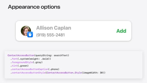
Meet the Contact Access Button
Learn about the new Contacts authorization modes and how to improve Contacts access in your app. Discover how to integrate the Contact Access Button into your app to share additional contacts on demand and provide an easier path to Contacts authorization. We’ll also cover Contacts security features and an alternative API to be used if the button isn’t appropriate for your app.
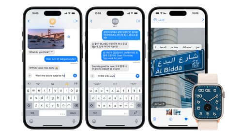
Build multilingual-ready apps
Ensure your app works properly and effectively for multilingual users. Learn best practices for text input, display, search, and formatting. Get details on typing in multiple languages without switching between keyboards. And find out how the latest advances in the String Catalog can make localization even easier.
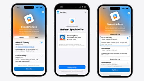
What’s new in StoreKit and In-App Purchase
Learn how to build and deliver even better purchase experiences using the App Store In-App Purchase system. We’ll demo new StoreKit views control styles and new APIs to improve your subscription customization, discuss new fields for transaction-level information, and explore new testability in Xcode. We’ll also review an important StoreKit deprecation.