How to create tinted icon
Asked on 2024-07-30
1 search

To create a tinted icon, you can follow the guidance provided in the session "Extend your app’s controls across the system" from WWDC 2024. Here are the steps:
-
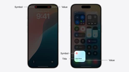
Provide a Tint Color: You can specify a tint color for your icon. For example, if you have a productivity app, you might use a specific shade of purple to match your app's branding.
-
Apply the Tint Color: The tint color will be used to tint the symbol when the toggle is on. This ensures that the symbol and any value text have the specified tint color.
Here is a relevant excerpt from the session:
"Provide a tint color. I'll use the color of my productivity app purple purple for productivity. The tint color will be used to tint the symbol when the toggle is on. Here's the fully styled control working on the lock screen and with the action button using the same code that makes it work in control center when the control is on. The symbol and any value text have the specified tint color."
For more detailed information, you can refer to the session Extend your app’s controls across the system (06:12).
Relevant Sessions
Evolve your document launch experience
Make your document-based app stand out, and bring its unique identity into focus with the new document launch experience. Learn how to leverage the new API to customize the first screen people see when they launch your app. Utilize the new system-provided design, and amend it with custom actions, delightful decorative views, and impressive animations.

Discover RealityKit APIs for iOS, macOS and visionOS
Learn how new cross-platform APIs in RealityKit can help you build immersive apps for iOS, macOS, and visionOS. Check out the new hover effects, lights and shadows, and portal crossing features, and view them in action through real examples.
Extend your app’s controls across the system
Bring your app’s controls to Control Center, the Lock Screen, and beyond. Learn how you can use WidgetKit to extend your app’s controls to the system experience. We’ll cover how you can to build a control, tailor its appearance, and make it configurable.