app for icons
Asked on 2025-06-26
1 search

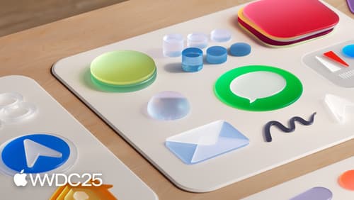
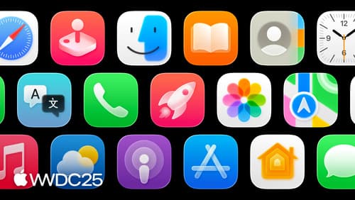
Apple introduced a new design language for app icons at WWDC 2025, marking a significant shift in how icons are crafted and perceived across their platforms. This new era for icons emphasizes storytelling and brand identity, encouraging developers to explore creative possibilities and push the boundaries of icon design.
The session titled "Say hello to the new look of app icons" provides an overview of these updates, including the use of softer light-to-dark gradients, system light and dark gradients, and the recommendation to use colored backgrounds for better distinction in dark mode. This session also highlights the importance of icons in storytelling and brand identity (Say hello to the new look of app icons).
Additionally, Apple introduced a tool called Icon Composer, which helps developers create app icons that look and feel consistent across iPhone, iPad, Mac, and Apple Watch. This tool allows for the use of dynamic properties like blur, shadow, and translucency, and supports the creation of flat icons compatible with previous operating systems (Create icons with Icon Composer).
For more detailed guidance on using Icon Composer, the session "Create icons with Icon Composer" is recommended, which provides insights into the design process and how to leverage the new material effects (Create icons with Icon Composer).
These updates are part of a broader effort to bring greater consistency and personalization to Apple's platforms, as highlighted in the WWDC 2025 Keynote (Keynote).
Say hello to the new look of app icons
Get an overview of the new app icon appearances for iOS, iPadOS, and macOS, including light and dark tints, and clear options. Learn how to use frostiness and translucency to make your app icon more vibrant, dynamic, and expressive, and find out how to ensure your icon works well with specular highlights.
Keynote
Don’t miss the exciting reveal of the latest Apple software and technologies.
Create icons with Icon Composer
Learn how to use Icon Composer to make updated app icons for iOS, iPadOS, macOS, and watchOS. Find out how to export assets from your design tool of choice, add them to Icon Composer, apply real-time glass properties and other effects, and preview and adjust for different platforms and appearance modes.