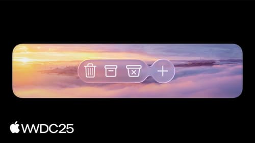
bottomAccessory
Asked on 2025-08-26
1 search

The concept of a "bottom accessory" in the context of Apple's WWDC sessions refers to a UI element that can be added to the bottom of a tab bar or other similar UI components. This is particularly relevant in the design of apps using UIKit or SwiftUI, where you can create a bottom accessory to enhance the user interface by providing additional controls or information.
For UIKit, you can create a UITabAccessory with your content view and set it as the bottom accessory property on a UITabBarController. This allows the accessory to be displayed in line with the tab bar, and it can adapt to changes in the environment, such as when the tab bar is minimized or expanded. You can learn more about this in the session Build a UIKit app with the new design.
In SwiftUI, you can use the TabView with a BottomAccessory modifier to place a view above the tab bar. This takes advantage of the extra space provided by the tab bar's collapsing behavior, allowing you to keep important controls close at hand. This is discussed in the session Build a SwiftUI app with the new design.
These features are part of Apple's efforts to provide more flexible and adaptive UI components that enhance the user experience across different devices and screen sizes.
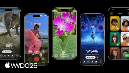
Build a UIKit app with the new design
Update your UIKit app to take full advantage of the new design system. We’ll dive into key changes to tab views, split views, bars, presentations, search, and controls, and show you how to use Liquid Glass in your custom UI. To get the most out of this video, we recommend first watching “Get to know the new design system” for general design guidance.

Build a SwiftUI app with the new design
Explore the ways Liquid Glass transforms the look and feel of your app. Discover how this stunning new material enhances toolbars, controls, and app structures across platforms, providing delightful interactions and seamlessly integrating your app with the system. Learn how to adopt new APIs that can help you make the most of Liquid Glass.
Build an AppKit app with the new design
Update your AppKit app to take full advantage of the new design system. We’ll dive into key changes to tab views, split views, bars, presentations, search, and controls, and show you how to use Liquid Glass in your custom UI. To get the most out of this video, we recommend first watching “Get to know the new design system” for general design guidance.