flame graph
Asked on 2025-06-16
1 search

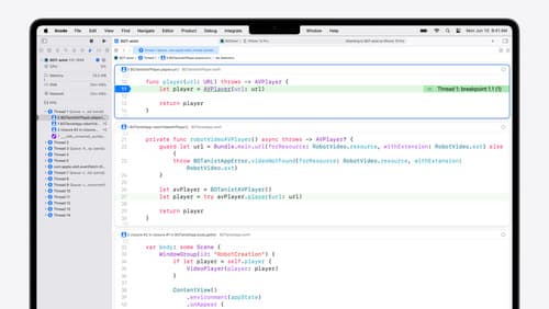
A flame graph is a graphical representation used to visualize function costs and relationships in code execution. It is particularly useful for performance analysis and optimization. The width of the bars in a flame graph represents the time a function took to execute, while the rows represent nested call stacks. Different colors are used to indicate the source of the code, such as system frameworks, the Swift runtime, or custom app binaries.
Flame graphs can be generated using tools like Instruments in Xcode, which provide a high-level overview of trace execution. They help identify performance bottlenecks by showing which parts of the code are consuming the most CPU time. For example, in the session "Optimize CPU performance with Instruments," a flame graph is used to show execution visually, highlighting the overhead of emitting signposts and the exact calls made over time on the CPU.
For more details, you can refer to the session Optimize CPU performance with Instruments (16:36) where flame graphs are discussed in the context of CPU performance optimization.

Optimize CPU performance with Instruments
Learn how to optimize your app for Apple silicon with two new hardware-assisted tools in Instruments. We’ll start by covering how to profile your app, then dive deeper by showing every single function called with Processor Trace. We’ll also discuss how to use CPU Counters’ modes to analyze your code for CPU bottlenecks.
What’s new in Xcode 16
Discover the latest productivity and performance improvements in Xcode 16. Learn about enhancements to code completion, diagnostics, and Xcode Previews. Find out more about updates in builds and explore improvements in debugging and Instruments.

Improve memory usage and performance with Swift
Discover ways to improve the performance and memory management of your Swift code. We’ll explore ways to refine your code – from making high-level algorithmic changes to adopting the new InlineArray and Span types for finer control over memory and allocations.