How do I make a UIButton with AttributedString glass with a tinted color?
Asked on 2026-03-16
1 search

To create a UIButton with an AttributedString and apply a glass effect with a tinted color, you can follow these steps based on the information from the WWDC sessions:
-
Use Liquid Glass: Utilize the new Liquid Glass appearance for buttons. You can use the
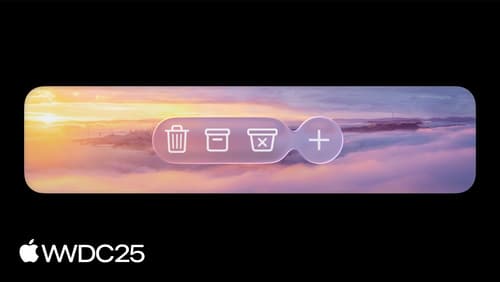
UIButtonConfigurationto apply a glass effect. There are two configurations available: standard glass and prominent glass, which is tinted with your app's tint color. -
Apply Tint Color: Set the tint color for the button to emphasize it as a primary element in your UI. This can be done by setting the button's tint color property.
-
AttributedString for Text: Use
AttributedStringto customize the text appearance on the button. You can set attributes like font, color, and more to style the text.
Here's a basic example of how you might set this up in code:
let button = UIButton(type: .system)
var configuration = UIButton.Configuration.glass()
configuration.title = "Your Button Title"
configuration.attributedTitle = AttributedString("Your Button Title", attributes: [.foregroundColor: UIColor.systemOrange])
button.configuration = configuration
button.tintColor = UIColor.systemOrange
For more detailed guidance on using Liquid Glass and configuring buttons, you can refer to the session Build a UIKit app with the new design (17:24).
Build a UIKit app with the new design
Update your UIKit app to take full advantage of the new design system. We’ll dive into key changes to tab views, split views, bars, presentations, search, and controls, and show you how to use Liquid Glass in your custom UI. To get the most out of this video, we recommend first watching “Get to know the new design system” for general design guidance.
Meet Liquid Glass
Liquid Glass unifies Apple platform design language while providing a more dynamic and expressive user experience. Get to know the design principles of Liquid Glass, explore its core optical and physical properties, and learn where to use it and why.
Build an AppKit app with the new design
Update your AppKit app to take full advantage of the new design system. We’ll dive into key changes to tab views, split views, bars, presentations, search, and controls, and show you how to use Liquid Glass in your custom UI. To get the most out of this video, we recommend first watching “Get to know the new design system” for general design guidance.