How do I match the corner radius of the device?
Asked on 2025-06-11
1 search

To match the corner radius of the device, you can use the new design system's concept of concentricity. This involves aligning the radii and margins around a shared center to create a unified rhythm between the UI and the device's hardware. Here are some key points from the sessions:
-
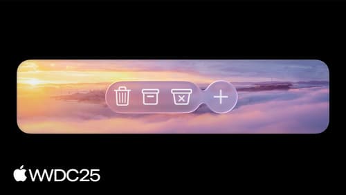
Concentric Shapes: Use concentric shapes that align with the window edge for better balance. This helps in maintaining a sense of harmony and balance in your app's design. For phone layouts, using a capsule with extra margin can create space near the screen edge. For iPad and Mac, a concentric shape that aligns with the window edge is recommended (Get to know the new design system).
-
Container Relative Corner Configuration: In UIKit, you can use the container relative corner configuration to have corners automatically adapt to their container. This means that as you move a view closer to the container's corner, its corner radius adapts automatically (Build a UIKit app with the new design).
-
NSView Layout Region API: In AppKit, to position content that nests into a corner, you can use the new NSView Layout Region API. This API helps in describing an area of a view with features like corner avoidance built in (Build an AppKit app with the new design).
These techniques ensure that your app's UI elements maintain a consistent and harmonious appearance with the device's design.
Build an AppKit app with the new design
Update your AppKit app to take full advantage of the new design system. We’ll dive into key changes to tab views, split views, bars, presentations, search, and controls, and show you how to use Liquid Glass in your custom UI. To get the most out of this video, we recommend first watching “Get to know the new design system” for general design guidance.
Build a UIKit app with the new design
Update your UIKit app to take full advantage of the new design system. We’ll dive into key changes to tab views, split views, bars, presentations, search, and controls, and show you how to use Liquid Glass in your custom UI. To get the most out of this video, we recommend first watching “Get to know the new design system” for general design guidance.
Get to know the new design system
Dive deeper into the new design system to explore key changes to visual design, information architecture, and core system components. Learn how the system reshapes the relationship between interface and content, enabling you to create designs that are dynamic, harmonious, and consistent across devices, screen sizes, and input modes.