How do I use the bottom sheet?
Asked on 2025-06-12
1 search

To use the bottom sheet in your app, you can take advantage of the new design features introduced in iOS 26. Here's a brief overview of how you can implement and customize bottom sheets:
-
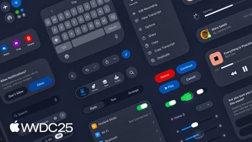
Partial Height Sheets: By default, sheets are inset with a liquid gloss background. At smaller heights, the bottom edges pull in, nesting in the curved edges of the display. When transitioning to a full height sheet, the glass background gradually transitions, becoming opaque and anchoring to the edge of the screen. This creates a smooth visual transition as the sheet expands or contracts.
-
Morphing from Buttons: Sheets can morph directly out of buttons that present them. To achieve this, make the presenting toolbar item a source for a navigation zoom transition and mark the content of your sheet as a destination of the transition. This creates a seamless transition effect from the button to the sheet.
-
Liquid Glass Layer: The new design system introduces Liquid Glass, which is a functional layer in the UI that floats above your content. It helps in creating a clear and structured interface without stealing focus from the main content. This can be particularly useful for bottom sheets to maintain a clean and immersive user experience.
For more detailed guidance, you can refer to the session Build a SwiftUI app with the new design (05:35) where these concepts are discussed in the context of SwiftUI apps.

Build a SwiftUI app with the new design
Explore the ways Liquid Glass transforms the look and feel of your app. Discover how this stunning new material enhances toolbars, controls, and app structures across platforms, providing delightful interactions and seamlessly integrating your app with the system. Learn how to adopt new APIs that can help you make the most of Liquid Glass.
Get to know the new design system
Dive deeper into the new design system to explore key changes to visual design, information architecture, and core system components. Learn how the system reshapes the relationship between interface and content, enabling you to create designs that are dynamic, harmonious, and consistent across devices, screen sizes, and input modes.
Build a UIKit app with the new design
Update your UIKit app to take full advantage of the new design system. We’ll dive into key changes to tab views, split views, bars, presentations, search, and controls, and show you how to use Liquid Glass in your custom UI. To get the most out of this video, we recommend first watching “Get to know the new design system” for general design guidance.