how should i use a Button in bottombar that has icon and text? i tried with .labelStyle(.titleAndIcon) but don't seem to work
Asked on 2025-06-11
1 search

To use a button in a bottom bar with both an icon and text in SwiftUI, you should ensure that you are using the correct approach to combine these elements. The .labelStyle(.titleAndIcon) modifier should work, but if it doesn't seem to be working as expected, you might want to check the following:
-
Ensure Correct Usage: Make sure you are applying the
.labelStyle(.titleAndIcon)modifier to aLabelview, which is designed to combine text and an icon. -
Use a
Label: TheLabelview is specifically designed to display an icon and text together. Here's a basic example:Label("Button Text", systemImage: "star") .labelStyle(.titleAndIcon) -
Check for Compatibility: Ensure that your SwiftUI version supports the
.titleAndIconlabel style. This style should be available in recent versions of SwiftUI. -
Custom Implementation: If the default label style doesn't work, you can manually create a button with an
HStackto combine anImageandText:Button(action: { // Your action here }) { HStack { Image(systemName: "star") Text("Button Text") } }
If you are implementing a custom tab bar or bottom bar, ensure that you are following the guidelines for custom views as mentioned in the session Get started with Dynamic Type (11:58). This session discusses the importance of maintaining focus on the app's content and how to handle custom bars effectively.
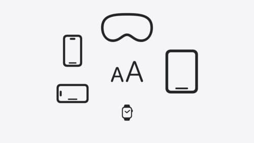
Get started with Dynamic Type
Dynamic Type lets people choose their preferred text size across the system and all of their apps. To help you get started supporting Dynamic Type, we’ll cover the fundamentals: How it works, how to find issues with scaling text in your app, and how to take practical steps using SwiftUI and UIKit to create a great Dynamic Type experience. We’ll also show how you can best use the Large Content Viewer to make navigation controls accessible to everyone.
Get to know the new design system
Dive deeper into the new design system to explore key changes to visual design, information architecture, and core system components. Learn how the system reshapes the relationship between interface and content, enabling you to create designs that are dynamic, harmonious, and consistent across devices, screen sizes, and input modes.

Build a SwiftUI app with the new design
Explore the ways Liquid Glass transforms the look and feel of your app. Discover how this stunning new material enhances toolbars, controls, and app structures across platforms, providing delightful interactions and seamlessly integrating your app with the system. Learn how to adopt new APIs that can help you make the most of Liquid Glass.