I want to know in detail how deal with toolbars for macos26 using Liquid Glass and all the options we have
Asked on 2026-05-17
1 search

To effectively deal with toolbars in macOS 26 using Liquid Glass, you have several options and techniques available. Here's a detailed overview based on the sessions from WWDC 2025:
Liquid Glass Overview
Liquid Glass is a new design material that provides a translucent, glass-like effect, enhancing the visual depth and focus on your app's content. It adapts to the brightness of the content behind it, switching between light and dark appearances as needed.
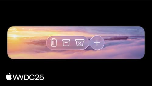
Toolbars with Liquid Glass
-
Automatic Grouping: AppKit automatically groups multiple toolbar buttons together on one piece of glass. Different types of controls, such as segmented controls and pop-up buttons, are separated into their own glass elements. This grouping is based on the type of each item's control view. You can override this behavior using
NSToolbarItemGroupto group items or insert spacers to separate them. -
Adaptive Material: The Liquid Glass material is adaptive, reacting intelligently to its context. It changes its appearance to suit the brightness of the content behind it, ensuring that toolbar items remain legible.
-
Customization Options:
- Use the
NSToolbarItemstyle property to specify a prominent style, which tints the glass using the accent color. This is useful for displaying state or emphasizing important actions. - The
NSItemBadgeAPI can be used to indicate new or pending content, such as unread messages or notifications.
- Use the
-
Visual Effects: The toolbar glass will switch between light and dark appearances based on the scrolled content's brightness. This change is communicated using the
NSAppearancesystem, so any work done to support dark mode applies here as well. -
Toolbar Spacer API: This API allows you to create fixed or flexible spaces between toolbar items, providing visual clarity and grouping related actions together.
Implementing Liquid Glass in Toolbars
- Start with Xcode 26: Build your app with Xcode 26 to automatically adopt the new design. Extend your content edge-to-edge and adapt to new control sizes by auditing your app for hard-coded control heights or inflexible layout constraints.
- Use Glass Effect Container: Create an
NSGlassEffectContainerViewand set your stack view as its content view. This allows you to integrate the Liquid Glass material seamlessly into your existing layout.
For more detailed guidance, you can refer to the session Build an AppKit app with the new design (01:23) and Build a SwiftUI app with the new design (07:49) for specific implementation techniques and examples.
Build a SwiftUI app with the new design
Explore the ways Liquid Glass transforms the look and feel of your app. Discover how this stunning new material enhances toolbars, controls, and app structures across platforms, providing delightful interactions and seamlessly integrating your app with the system. Learn how to adopt new APIs that can help you make the most of Liquid Glass.
Platforms State of the Union
Discover the newest advancements on Apple platforms.
Build an AppKit app with the new design
Update your AppKit app to take full advantage of the new design system. We’ll dive into key changes to tab views, split views, bars, presentations, search, and controls, and show you how to use Liquid Glass in your custom UI. To get the most out of this video, we recommend first watching “Get to know the new design system” for general design guidance.