Isn't the new liquid design fail accessibility tests
Asked on 2025-06-11
1 search

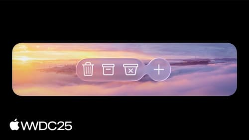
The new Liquid Glass design introduced by Apple at WWDC is designed with accessibility in mind. According to the session Meet Liquid Glass, legibility was a central consideration in its design. Elements like navigation bars and tab bars adapt their appearance based on the background to ensure they are easily discernible, flipping from light to dark to maximize contrast. Additionally, the session mentions that there are several accessibility features that Liquid Glass offers, such as reduced transparency to make it frostier, which can help users with different needs.
If you are concerned about accessibility, it is recommended to evaluate your app using the guidelines provided in the session Evaluate your app for Accessibility Nutrition Labels, which discusses ensuring high contrast and other accessibility features.
Overall, the Liquid Glass design aims to enhance accessibility rather than fail accessibility tests.

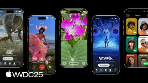
Build a SwiftUI app with the new design
Explore the ways Liquid Glass transforms the look and feel of your app. Discover how this stunning new material enhances toolbars, controls, and app structures across platforms, providing delightful interactions and seamlessly integrating your app with the system. Learn how to adopt new APIs that can help you make the most of Liquid Glass.
Build a UIKit app with the new design
Update your UIKit app to take full advantage of the new design system. We’ll dive into key changes to tab views, split views, bars, presentations, search, and controls, and show you how to use Liquid Glass in your custom UI. To get the most out of this video, we recommend first watching “Get to know the new design system” for general design guidance.
Build an AppKit app with the new design
Update your AppKit app to take full advantage of the new design system. We’ll dive into key changes to tab views, split views, bars, presentations, search, and controls, and show you how to use Liquid Glass in your custom UI. To get the most out of this video, we recommend first watching “Get to know the new design system” for general design guidance.