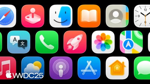
Say hello to the new look of app icons
Asked on 2025-07-03
1 search

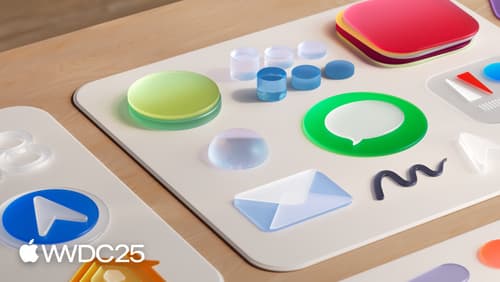
Apple introduced a completely reimagined look for app icons at WWDC 2025. The new design language for app icons is inspired by layered icons on Vision OS and real glass properties, resulting in a Liquid Glass material specifically for app icons. This material adds depth and a sense of being lit from within, with dynamic effects like translucency and edge highlights. The new design system is unified across Apple devices, making it easier to design icons for iPhone, iPad, Mac, and Apple Watch.
The session titled "Say hello to the new look of app icons" provides an in-depth look at these updates, including the creative vision behind the design, the new appearance modes, and the underlying design system. The session also discusses the use of gradients, the importance of color in backgrounds, and the new grid system for designing icons.
For more detailed information, you can watch the session Say hello to the new look of app icons (00:00:00).
Create icons with Icon Composer
Learn how to use Icon Composer to make updated app icons for iOS, iPadOS, macOS, and watchOS. Find out how to export assets from your design tool of choice, add them to Icon Composer, apply real-time glass properties and other effects, and preview and adjust for different platforms and appearance modes.
Say hello to the new look of app icons
Get an overview of the new app icon appearances for iOS, iPadOS, and macOS, including light and dark tints, and clear options. Learn how to use frostiness and translucency to make your app icon more vibrant, dynamic, and expressive, and find out how to ensure your icon works well with specular highlights.
What’s new in Xcode
Discover the latest productivity and performance advancements in Xcode 26. Learn how to leverage large language models in your development workflow. Explore editing and debugging enhancements, improved performance and testing tools, and Swift Build - the open-source build system engine used by Xcode.