What are some of the mistakes to avoid while adopting Liquid glass?
Asked on 2025-06-23
1 search

When adopting Liquid Glass, there are several mistakes to avoid to ensure clarity and maintain a clean user interface:
-
Avoid Tinting All Elements: Tinting every element can make nothing stand out and create confusion. Instead, use color in the content layer to imbue your app with color without overwhelming the interface. For example, a back button can be tinted to stand out as a primary action, but not all elements should be treated this way.
-
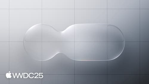
Avoid Glass on Glass: Stacking Liquid Glass elements on top of each other can make the interface feel cluttered and confusing. Instead, use fills, transparency, and vibrancy for the top elements to make them feel like a thin overlay that is part of the material.
-
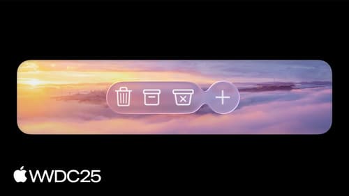
Limit Use to Important Elements: Liquid Glass should be reserved for the most important elements in your app, such as controls that belong in the top level of hierarchy. This helps maintain a clear and functional UI.
-
Avoid Intersections Between Content and Liquid Glass: Ensure there is a separation between content and Liquid Glass to avoid unwanted visual noise. Reposition or scale content to maintain this separation.
-
Do Not Mix Variants: There are two variants of Liquid Glass—regular and clear. They should not be mixed as they have different characteristics and use cases. Regular is versatile and adaptive, while clear is more transparent and should be used over media-rich content with a dimming layer for legibility.
-
Avoid Placing NSGlass Effect View Behind Content: When using AppKit, avoid placing the NSGlass effect view behind your content. Instead, use it as a sibling view to customize the appearance of the glass.
These guidelines help maintain the clarity and functionality of your app's interface when using Liquid Glass. For more detailed information, you can refer to the session Meet Liquid Glass (10:31).
Meet Liquid Glass
Liquid Glass unifies Apple platform design language while providing a more dynamic and expressive user experience. Get to know the design principles of Liquid Glass, explore its core optical and physical properties, and learn where to use it and why.
Build an AppKit app with the new design
Update your AppKit app to take full advantage of the new design system. We’ll dive into key changes to tab views, split views, bars, presentations, search, and controls, and show you how to use Liquid Glass in your custom UI. To get the most out of this video, we recommend first watching “Get to know the new design system” for general design guidance.
Build a UIKit app with the new design
Update your UIKit app to take full advantage of the new design system. We’ll dive into key changes to tab views, split views, bars, presentations, search, and controls, and show you how to use Liquid Glass in your custom UI. To get the most out of this video, we recommend first watching “Get to know the new design system” for general design guidance.