what are the best practices in adopting liquid design
Asked on 2026-07-17
1 search

The main best practices for adopting Liquid Glass are:
-
Use it sparingly and intentionally
- Reserve Liquid Glass for the navigation layer and other key controls that float above content.
- Don’t make everything glassy—overusing it can muddy the hierarchy.
-
Avoid “glass on glass”
- Stacking Liquid Glass elements on top of each other can make the interface feel cluttered and confusing.
-
Keep content in the content layer
- Let Liquid Glass support the UI, but keep the actual app content visually separate so it stays clear and readable.
-
Establish hierarchy, harmony, and consistency
- Apple calls out these as the three guiding principles:
- Hierarchy: controls should feel like a distinct functional layer
- Harmony: your design should complement the system’s rhythm
- Consistency: use system patterns so the experience works across platforms and screen sizes
- Apple calls out these as the three guiding principles:
-
Adopt standard controls where possible
- If you have custom controls, consider whether standard UIKit/SwiftUI/AppKit controls already fit better with the new design.
-
Audit your app screen by screen
- Identify which views stand out, where background elements should be removed, and where custom UI needs refinement.
-
Use shapes and spacing thoughtfully
- Prefer the system’s recommended shapes, especially concentric shapes and fallback behavior when components appear both nested and standalone.
- Watch for corners that feel too pinched or flared.
-
Make interfaces adapt to context
- Liquid Glass should remain clear and legible across light/dark backgrounds, window sizes, focus changes, and accessibility settings.
-
Respect accessibility and legibility
- Avoid tinting everything.
- Avoid content intersecting with glass.
- Let system accessibility settings like reduced transparency, increased contrast, and reduced motion work automatically.
If you want, I can also summarize the best practices specifically for UIKit, SwiftUI, or designing custom elements.
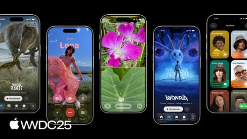
Build a UIKit app with the new design
Update your UIKit app to take full advantage of the new design system. We’ll dive into key changes to tab views, split views, bars, presentations, search, and controls, and show you how to use Liquid Glass in your custom UI. To get the most out of this video, we recommend first watching “Get to know the new design system” for general design guidance.
Platforms State of the Union
Discover the newest advancements on Apple platforms.

Build a SwiftUI app with the new design
Explore the ways Liquid Glass transforms the look and feel of your app. Discover how this stunning new material enhances toolbars, controls, and app structures across platforms, providing delightful interactions and seamlessly integrating your app with the system. Learn how to adopt new APIs that can help you make the most of Liquid Glass.