What guidance is there for using the new glass containers vs using a standard fullscreen cover?
Asked on 2025-06-11
1 search

When deciding between using the new glass containers and a standard fullscreen cover, consider the following guidance from the WWDC sessions:
-
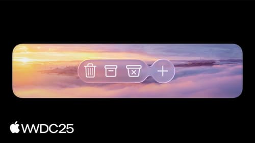
Purpose and Functionality: Glass containers are designed to create a distinct functional layer that floats above your app's content, providing a unique visual and interactive experience. They are best used for key controls and navigation elements that need to stand out and provide a sense of depth and hierarchy. In contrast, a standard fullscreen cover is typically used for modal presentations that temporarily take over the entire screen.
-
Visual and Interactive Design: The Liquid Glass effect offers a dynamic and visually engaging way to highlight important elements in your app. It adapts to the content and environment, providing a more fluid and interactive experience. This is particularly useful for elements that need to maintain a close relationship with the content beneath them, such as toolbars or floating buttons.
-
Performance and Consistency: Using a glass effect container can improve performance by sharing a sampling region among elements, which provides a consistent visual result. This is especially important when multiple glass elements are used together, as it avoids inconsistencies and improves rendering efficiency.
-
Design Harmony: It's important to ensure that your app's visual design language harmonizes with the Liquid Glass material. This means using it in a way that complements the system's rhythm and tone, rather than clashing with it. The glass effect should be used to enhance the user experience without overwhelming the interface.
For more detailed guidance on implementing Liquid Glass in your app, you can refer to the session Build a SwiftUI app with the new design (17:57) and Build an AppKit app with the new design (17:30).

Build a SwiftUI app with the new design
Explore the ways Liquid Glass transforms the look and feel of your app. Discover how this stunning new material enhances toolbars, controls, and app structures across platforms, providing delightful interactions and seamlessly integrating your app with the system. Learn how to adopt new APIs that can help you make the most of Liquid Glass.
Build an AppKit app with the new design
Update your AppKit app to take full advantage of the new design system. We’ll dive into key changes to tab views, split views, bars, presentations, search, and controls, and show you how to use Liquid Glass in your custom UI. To get the most out of this video, we recommend first watching “Get to know the new design system” for general design guidance.
Build a UIKit app with the new design
Update your UIKit app to take full advantage of the new design system. We’ll dive into key changes to tab views, split views, bars, presentations, search, and controls, and show you how to use Liquid Glass in your custom UI. To get the most out of this video, we recommend first watching “Get to know the new design system” for general design guidance.