What’s the deal with scroll edges?
Asked on 2025-06-11
1 search

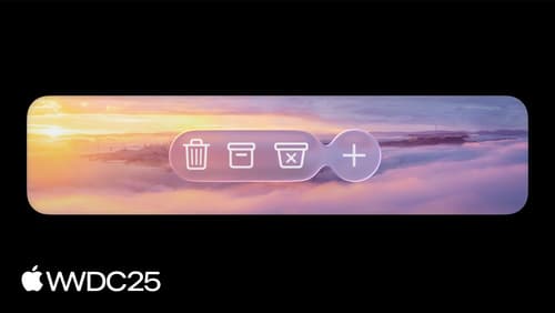
Scroll edge effects are a visual feature introduced to enhance the separation between UI elements and content, especially in dynamically scrolling environments. They work in concert with the Liquid Glass design to maintain legibility and clarity. These effects are inherently adaptive, meaning they adjust automatically as content scrolls beneath floating UI elements.
There are two main styles of scroll edge effects:
-
Soft Edge Style: This style progressively fades and blurs the content, providing a subtle transition. It is the default style and is commonly used on iOS and iPadOS, especially for interactive elements like buttons or inputs.
-
Hard Edge Style: This style uses a more opaque backing to create a stronger boundary, ideal for interactive text controls without backgrounds or pinned table headers that need extra clarity. It is mostly used on macOS.
Scroll edge effects are automatically applied in areas where UI elements overlap with scrolling content, such as underneath toolbar items or title bar accessories. They ensure that floating elements like titles remain clear and legible as content scrolls beneath them.
For more detailed information, you can refer to the session Build an AppKit app with the new design (09:27) where the scroll edge effect is introduced.
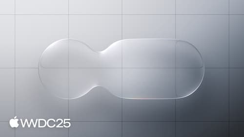
Meet Liquid Glass
Liquid Glass unifies Apple platform design language while providing a more dynamic and expressive user experience. Get to know the design principles of Liquid Glass, explore its core optical and physical properties, and learn where to use it and why.
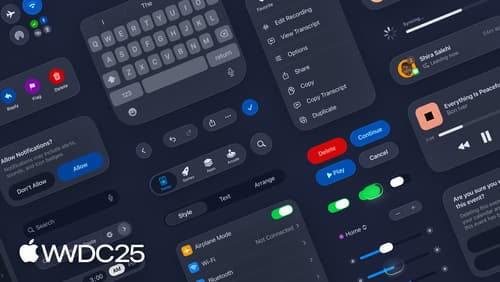
Build an AppKit app with the new design
Update your AppKit app to take full advantage of the new design system. We’ll dive into key changes to tab views, split views, bars, presentations, search, and controls, and show you how to use Liquid Glass in your custom UI. To get the most out of this video, we recommend first watching “Get to know the new design system” for general design guidance.
Get to know the new design system
Dive deeper into the new design system to explore key changes to visual design, information architecture, and core system components. Learn how the system reshapes the relationship between interface and content, enabling you to create designs that are dynamic, harmonious, and consistent across devices, screen sizes, and input modes.